+201112922926
Villa 67, Industrial Area, New Cairo, Cairo Governorate.
Power of power is a sophisticated brand name that stands for company specialized in business development and its core fields.
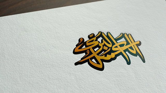
POP brand mark consists of 3 letters abbreviations; they stands for POWER OF POWER & you can feel the majesty in the size of the letters and how the 3 letters align to each other
An area of clear space has been defined to protect the integrity of POP mark. This space should remain free of any elements such as text, graphics, imagery, and other logos.
POP depends on using very dark colors to convey the prestigious, majestic & magnificent vibes you feel in the brand marks of the business field & also creating sub brands for the main scopes of work
The main pattern uses part from the logo & duplicate it in a very elegant way to suit the usage of it on the letterheads & envelops
The brand consists of 4 main sub fields so we design sub brands to differentiate its fields with its own colors

Clients
Projects
Years
Services


.jpg)


.jpg)


.jpg)