Naming Theme
Fresh Dough is a one-of-a-kind brand name that stands for art, not just taste.
It is warm and stunning, as in the tone of the whole portfolio.
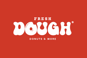
OUR BRAND MARK
FRESH DOUGH brand mark consists of Two words These Two words have a fixed size and position relative to each other,
which have been created as master artwork files. Our brand mark should not be redrawn, reset or altered in any way.
CLEAR SPACE
& MINIMUMSIZE
An area of clear space has been defined to protect the integrity
of MARINATED mark. This space should remain free of
any elements such as text, graphics, imagery, and other logos.
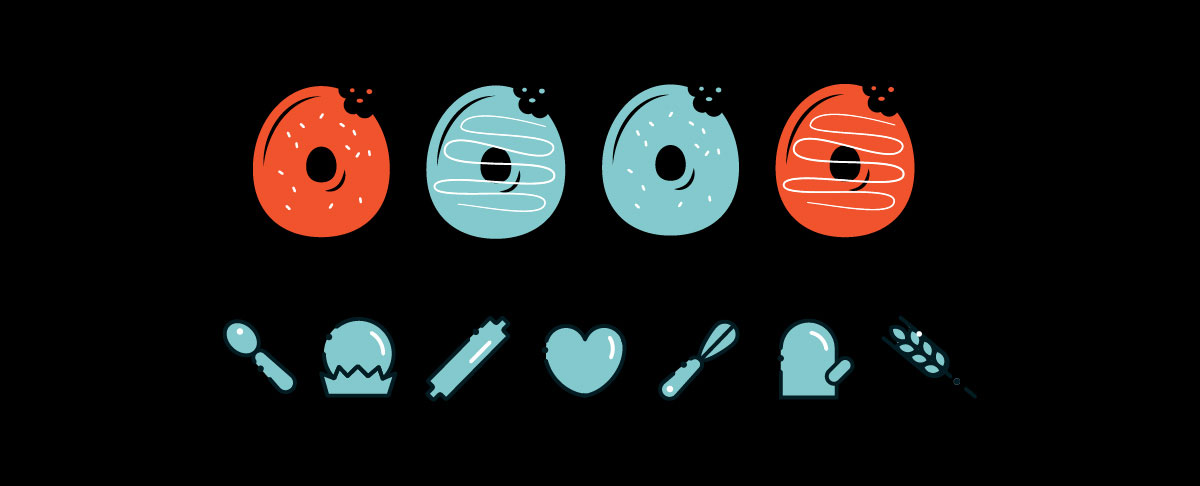
COLOR
FRESH DOUGH Brand marke relies on the use of a limited color palette to create a colorful happy feel for the brand.
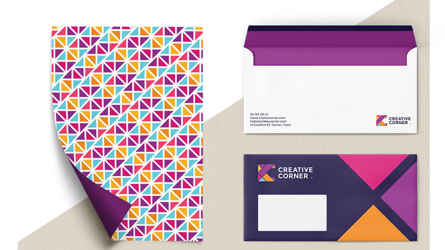
PATTERN
As shown on the right, we have a patterns which can be used for backgrounds.
The pattern are generally used in presentations as a
background for dividers or can be used as a pattern for
merchandise or digital wallpaper. Use the corresponding
theme if the topic is relevant, otherwise they can be
used as needed.
The main pattern symbolizesThe flow of sauce on the dishes with a unique design.
TYPOGRAPHY
THE LAWRENCE brand uses two typefaces.
Acumin Variable Concept is the headline typeface and body typeface for all touchpoints in both print and digital.
29LT Bukra Bold is the Arabic headline typeface and the Regular for body copy typeface arabic.
only use the weights and styles listed on the following page.
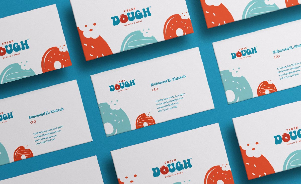
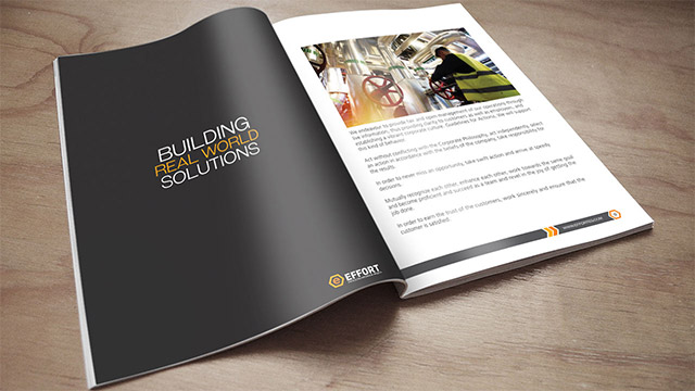
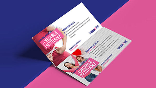
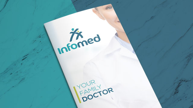
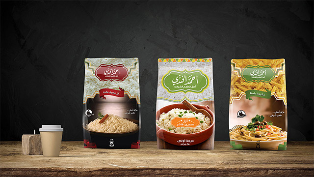
TOUCHPOINTS
The examples on the following pages
illustrate how the FRESH DOUGH brand can be brought to life across various print and digital touchpoints. All future design work should be based on the principles established�within these guidelines


.jpg)

.jpg)


.jpg)